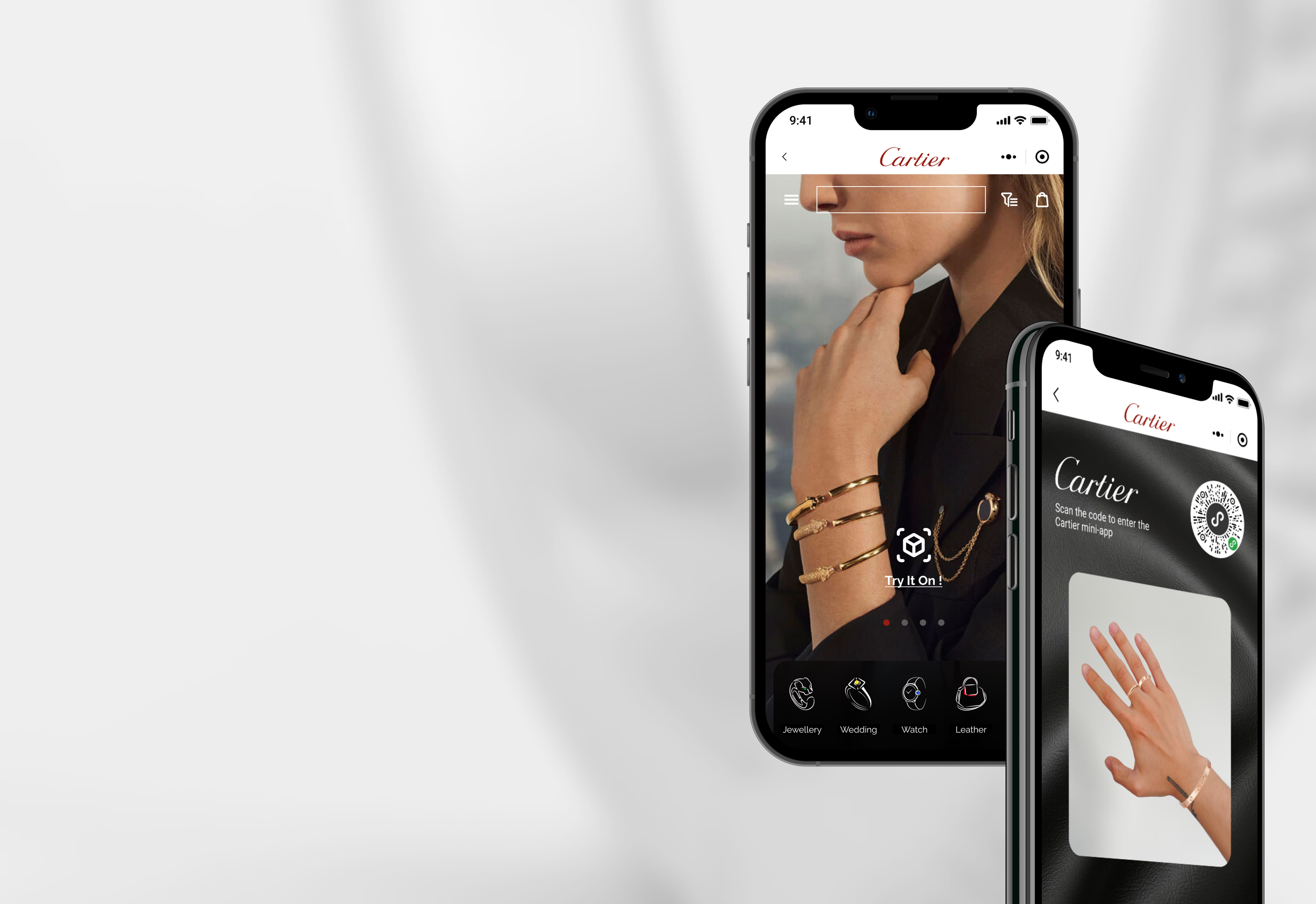
Cartier
Enriching the Online Try-on Experience
Tools
Figma
Photoshop
Illustrator
Role
UX Designer
UI Designer
Duration
2 Months
2021 Jul - Sep

OVERVIEW
Due to the impact of the pandemic and restrictions on outbound travel, the online luxury market in mainland China in 2020 reached a market size of nearly $53.5 billion, and online luxury sales grew by approximately 150%.
To make Cartier more competitive in the wave of digitalization process, the Cartier product team wants to use virtual try-on to increase the engagement of users on Cartier products.
To solve this problem, I created an immersive and authentic virtual try-on experience for the Cartier WeChat Mini-app, enabling users to enjoy the same level of engagement they would have while trying on products in-store.

Here is the story…
WHY CHOOSE VIRTUAL TRY-ON?

I first dive into exploring the customer's in-store try-on experience. The customers’ in-store try-on experience will help me to reshape my understanding of online virtual try-on.

What can we learn from an in-store and virtual try-on experience?
IN-STORE TRY-ON EXPERIENCE
Our team interviewed 12 consumers about their shopping experience in the Cartier shop. The interview task was to ask consumers to choose a gift for their friend in a Cartier shop.

Adequate lighting settings enlighten and retouch the users’ hand.
Key takeaways
The jewelry tray makes trying on a wide range of products easy.
Product details, such as materials and dimensions are important to the customer.
VIRTUAL TRY-ON EXPERIENCE
We observed 12 consumers using other competitive virtual try-on apps and collected feedback from them.
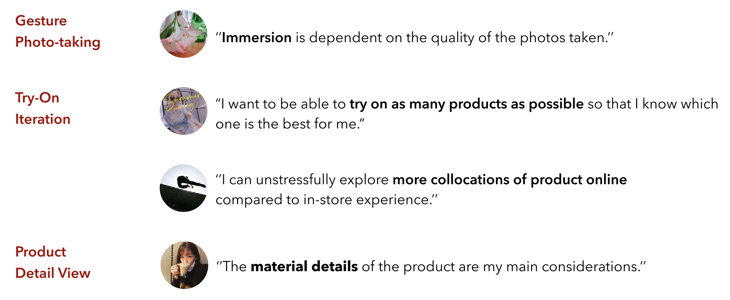
Gesture Photo - Taking ensures accuracy for image scanning and an immersive experience in later stage operation.
Key takeaways
Try-On Iteration allows customers to compare different products.
Product Detail Reviews help customers to know products better.
USER NEEDS
OUR USERS WANT:

Authenticity
Be able to experience authenticity and beauty just like the in-store try-on experience.

Flexibility
Confidently and easily choose the products they want to try on.

Clarity
In addition to price, get as much information as possible about the product, such as materials and dimensions.

How might we bring an immersive try-on experience online so that customers can enjoy a familiar offline quality of wear and the charm of Cartier products?
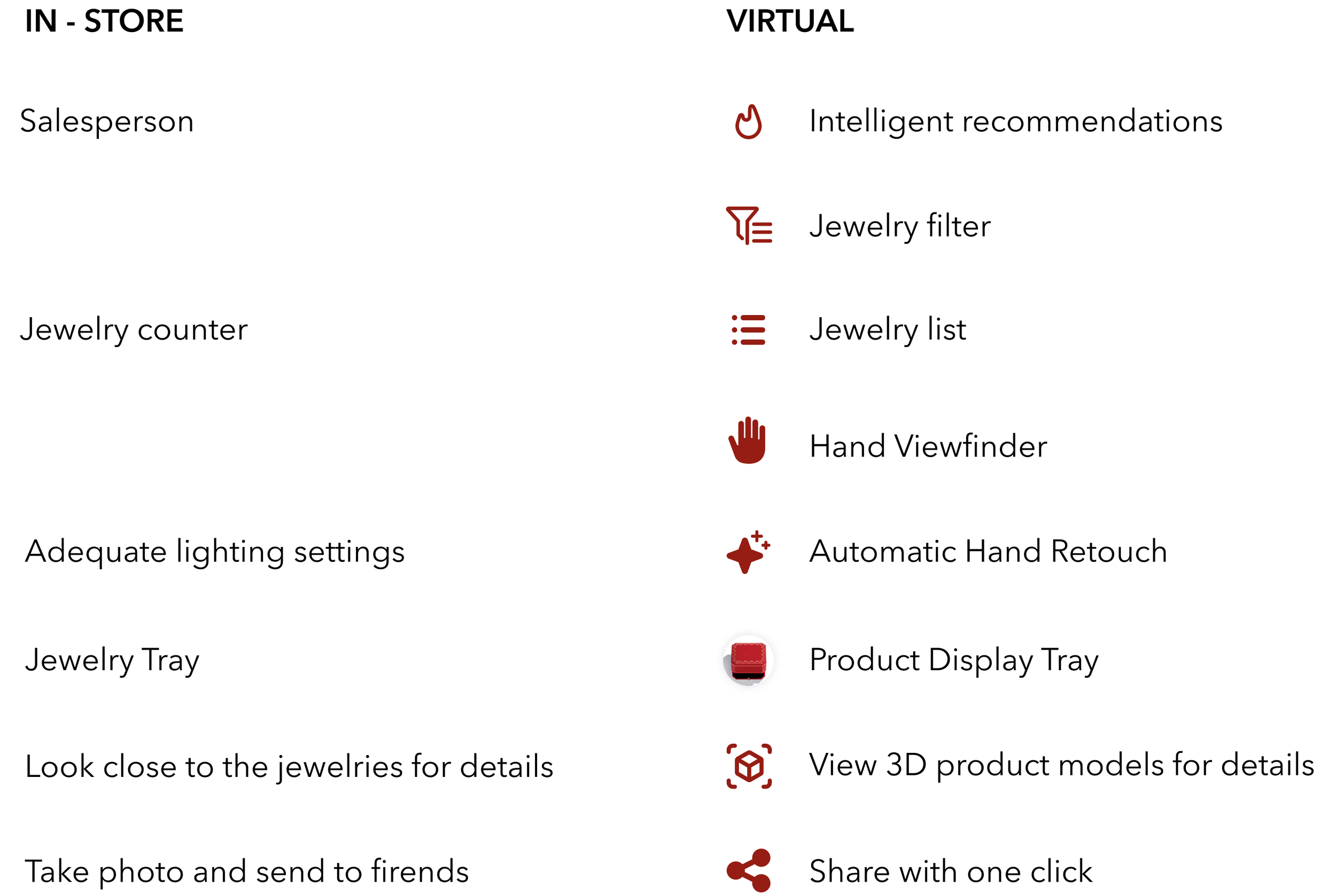
IN-STORE VS VIRTUAL
Some potential, in-store shopping elements could be moved online.
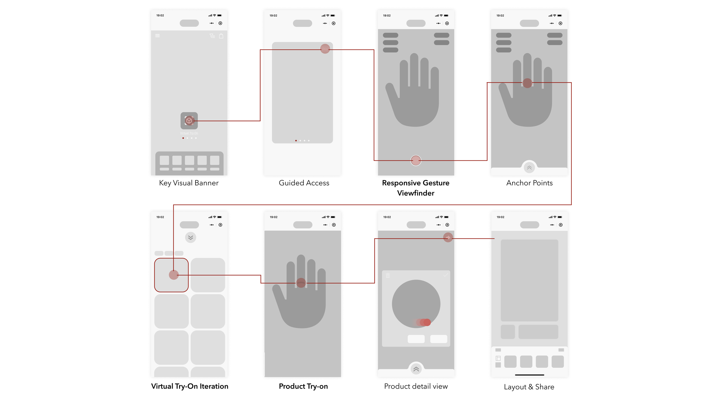
WIREFRAME

DESIGN FOR AUTHENTICITY - GESTURE VIEWFINDER
“I don't want to see the ring position doesn't match my fingers or be shown in the wrong size, then I have to spend some time to make adjustments myself.”
How can the hand be accurately scanned at the beginning to ensure that users can wear the ring successfully?
STEP 1: EXPLORE - THE USER’S MOST FAMILIAR UI

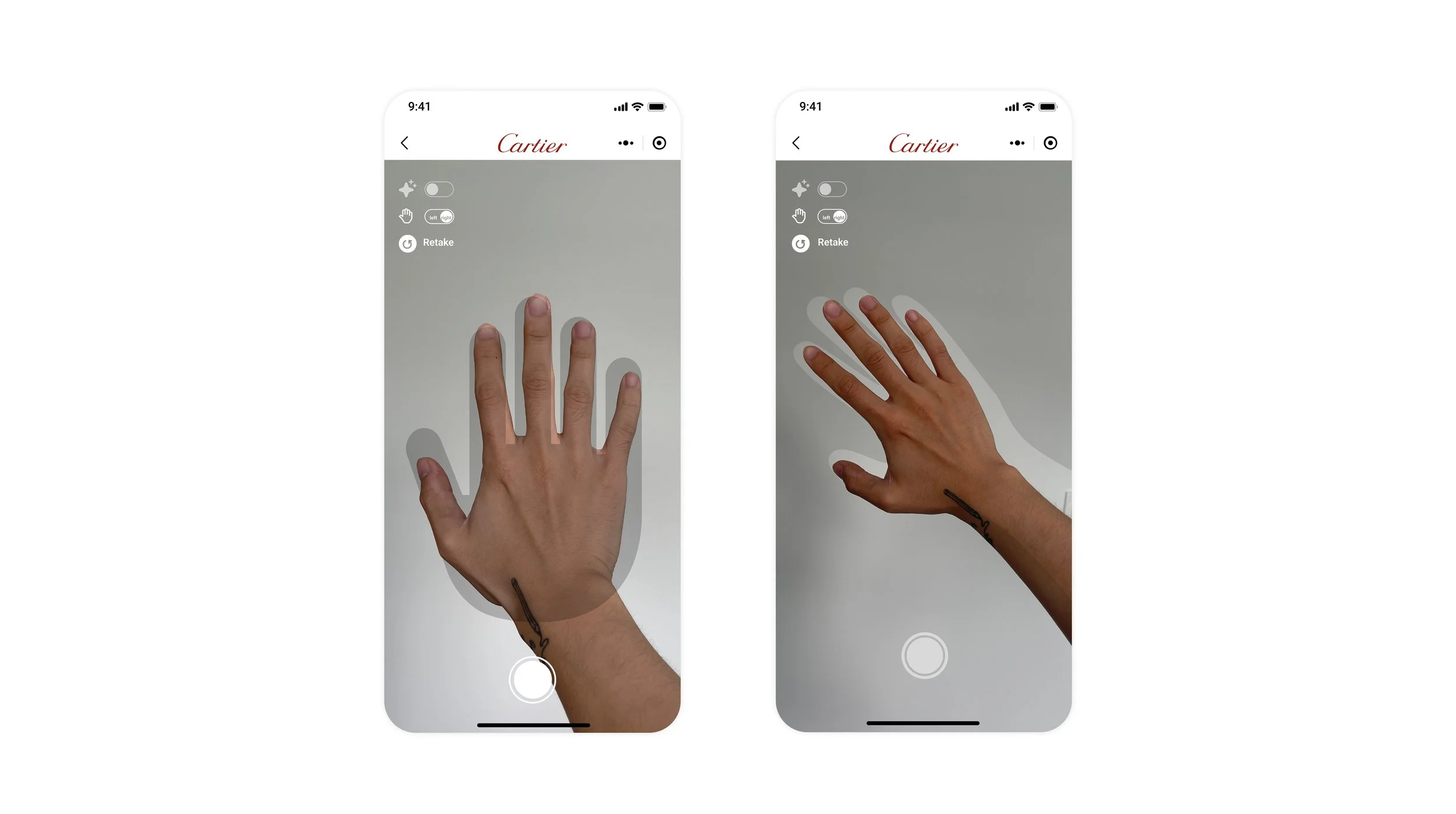
Gesture Viewfinder can lead users to place their hands correctly and ensure the accuracy of image scanning. However, when I tested this option, I quickly discovered that this is not the optimal solution for two reasons: The unnatural hand position for the framing angle and the lack of accessibility.
STEP 2: OPTIMIZE - ERGONOMICS
Before
After
Users can now place their hands naturally in the gesture viewfinder!
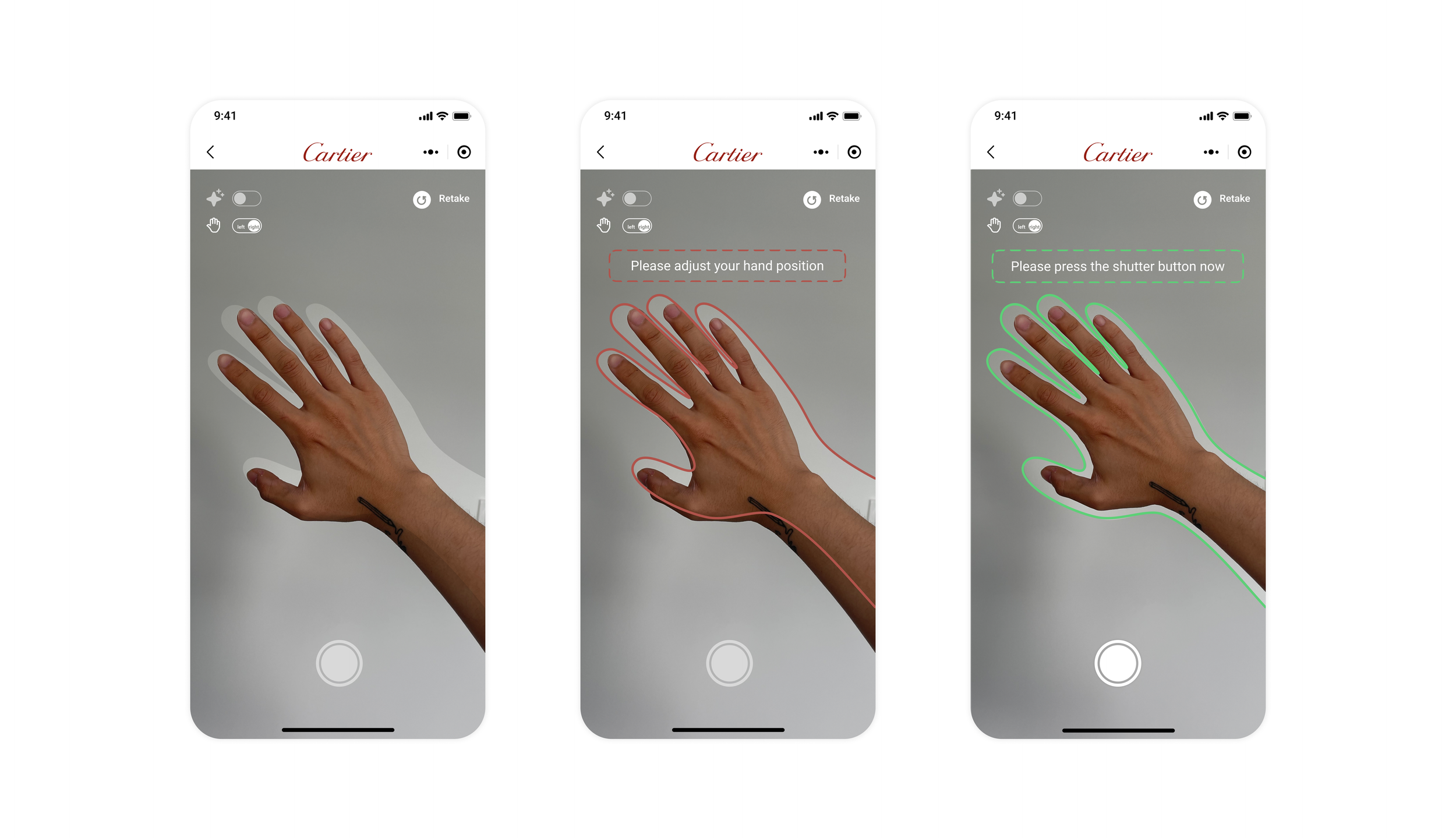
How to further guide the user to correctly place their hands in the viewfinder?
STEP 3: CRAFT - GUIDANCE
With visual guidance, users can take high-quality photos of their hands, thus improving the accuracy of their hand scans to create a more immersive online try-on experience.

DESIGN FOR AUTHENTICITY - Jewelry Display
“I want to be able to try on as many products as possible so that I know which one is the best for me.”
STEP 1: EXPLORE - THE USER’S MOST FAMILIAR UI
I started by exploring options in the user's most familiar UI, displaying some jewels for consumers to select. After selecting, the jewelry will be placed directly on the random finger of users.

Option 1
Option 2
Both options could only show a limited number of jewelry displays and lack authenticity. The process of users trying on jewelry online is not the real process of trying in the store.
How to create a jewelry display interface different from other online try-on products?
STEP 2: OPTIMIZE - JEWELRY SELECTION PROCESS
I suggested reviewing consumers’ in-store jewelry selection process to help us find a breakthrough.


DESIGN FOR FLEXIBILITY
“I want to unstressfully put the rings on any finger on my hand and adjust their position compared to the in-store experience”
STEP 1: EXPLORE - THE USER’S MOST FAMILIAR UI
I experimented with different ways of putting rings on the finger and evaluating their respective strengths and weaknesses.


Option 2
Tap to add
Option 1
Drag to Finger
Drag-to-finger looks intuitive and natural in operation, and users can pick a specific finger to try on, but lagging will occur while dragging the ring to the finger. For option 2, the ring can appear on the finger instantly, but users cannot pick a specific finger to try on.
How can we ensure that the user can choose a specific finger to wear from the start and that the process of putting on the ring is quick and natural?
STEP 2: OPTIMIZE - “TAP“ TO WEAR
To solve this problem, we decided to go with optimizing the "click" to wear option. During the design process, technical feasibility is taken into account.

When the user clicks on the ring, the anchor point on the hand is called out. The user can now select a specific finger to wear the jewelry on.
FINAL PROTOTYPING
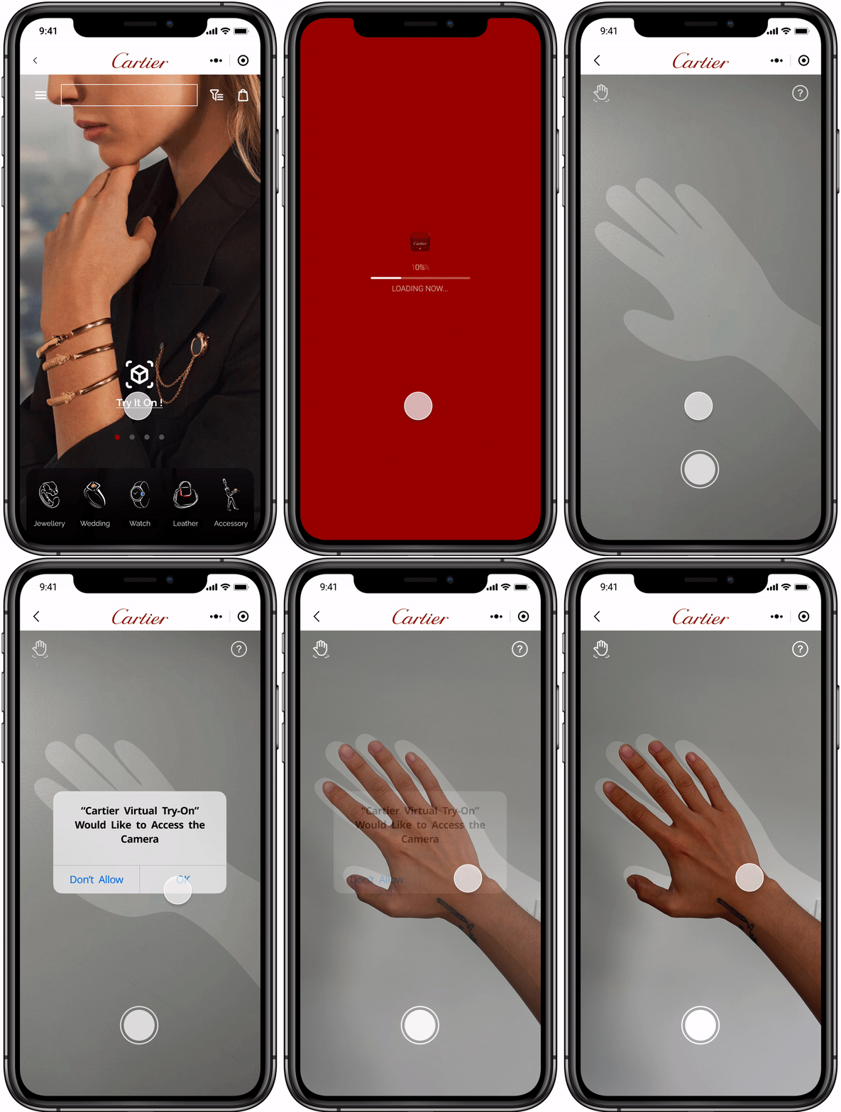
Cartier
AR Try-On Portal
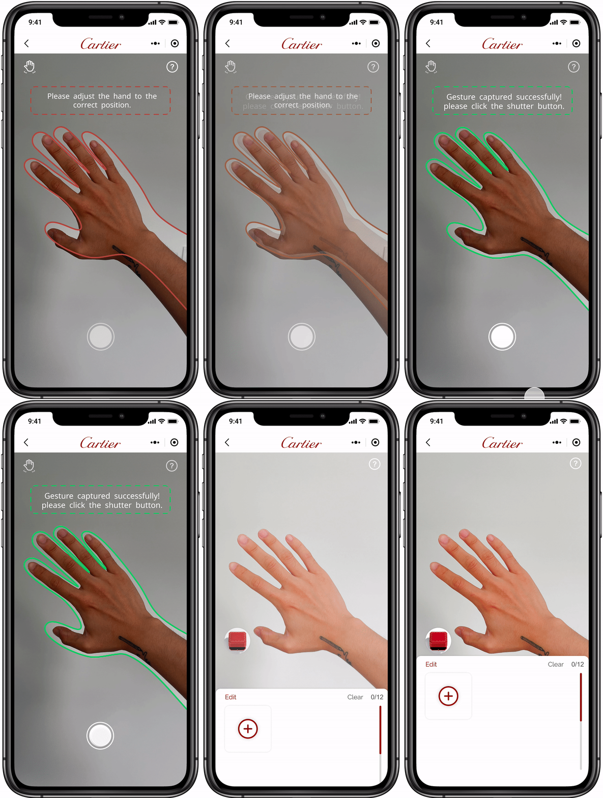
Dynamic Gesture Viewfinder
Accompanied by responsive guided text.
Automatically retouch photos to match the in-store lighting effects and create an immersive try-on experience.

Jewelry Box
Choose with Confidence
Users can access products through the Jewelry Box and confidently add up to 12 products for easy viewing and try-on.
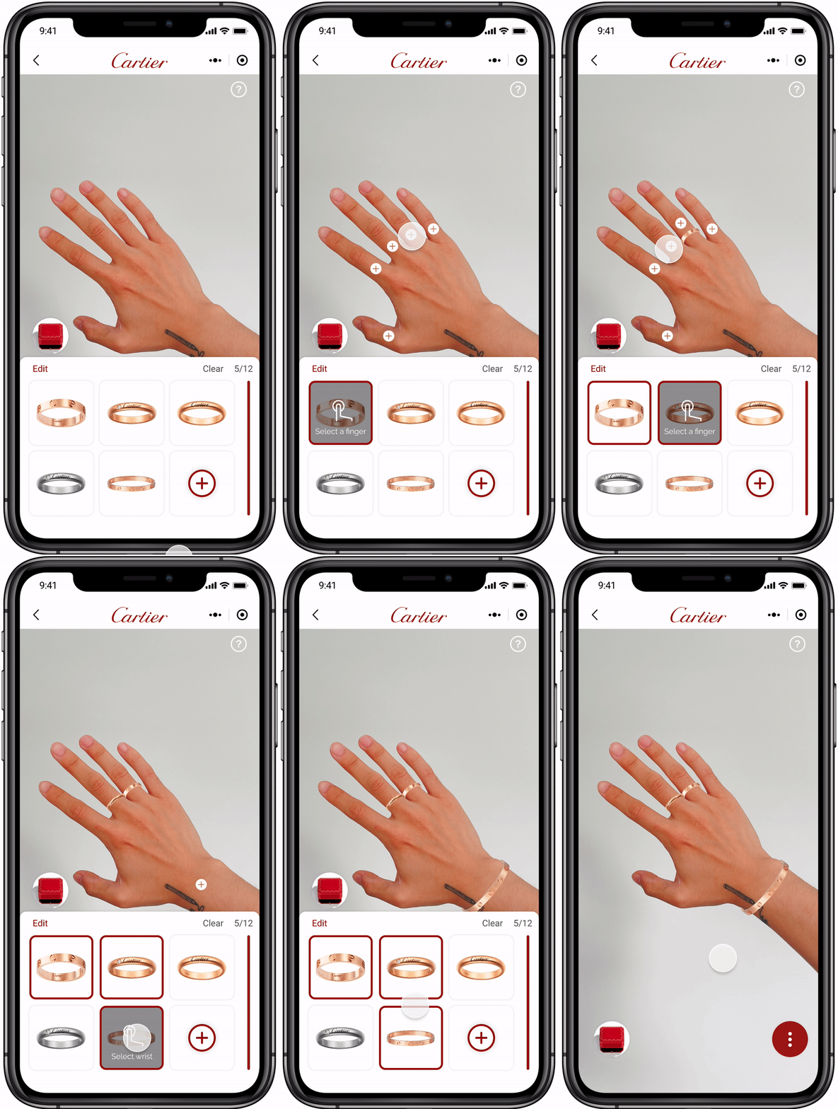
Click to Add
The call-out buttons allow users to click intuitively, reducing errors and allowing the product to better adapt to hand position and shape.
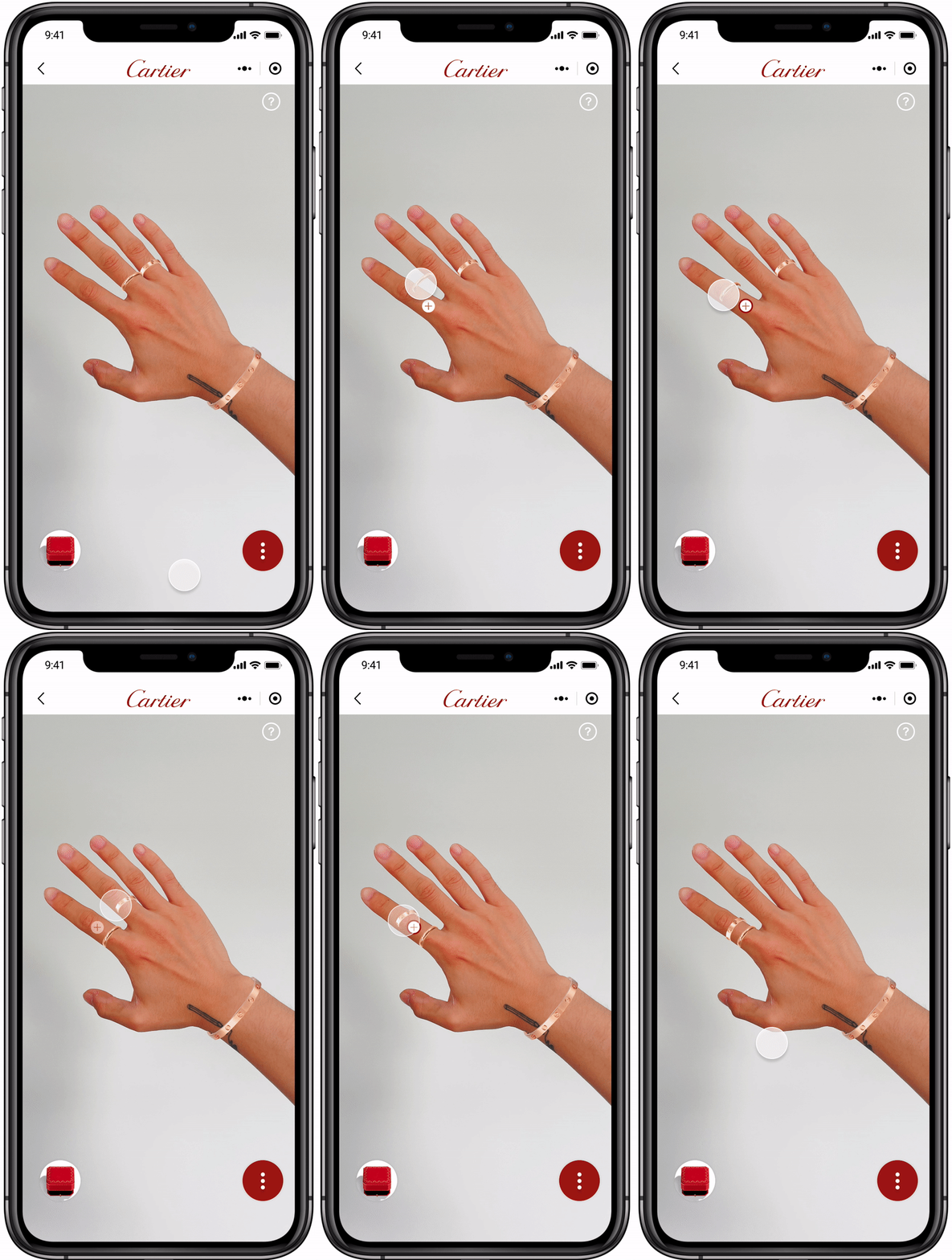
Drag to Move
The user can move the ring to preset positions by long-pressing on the product.
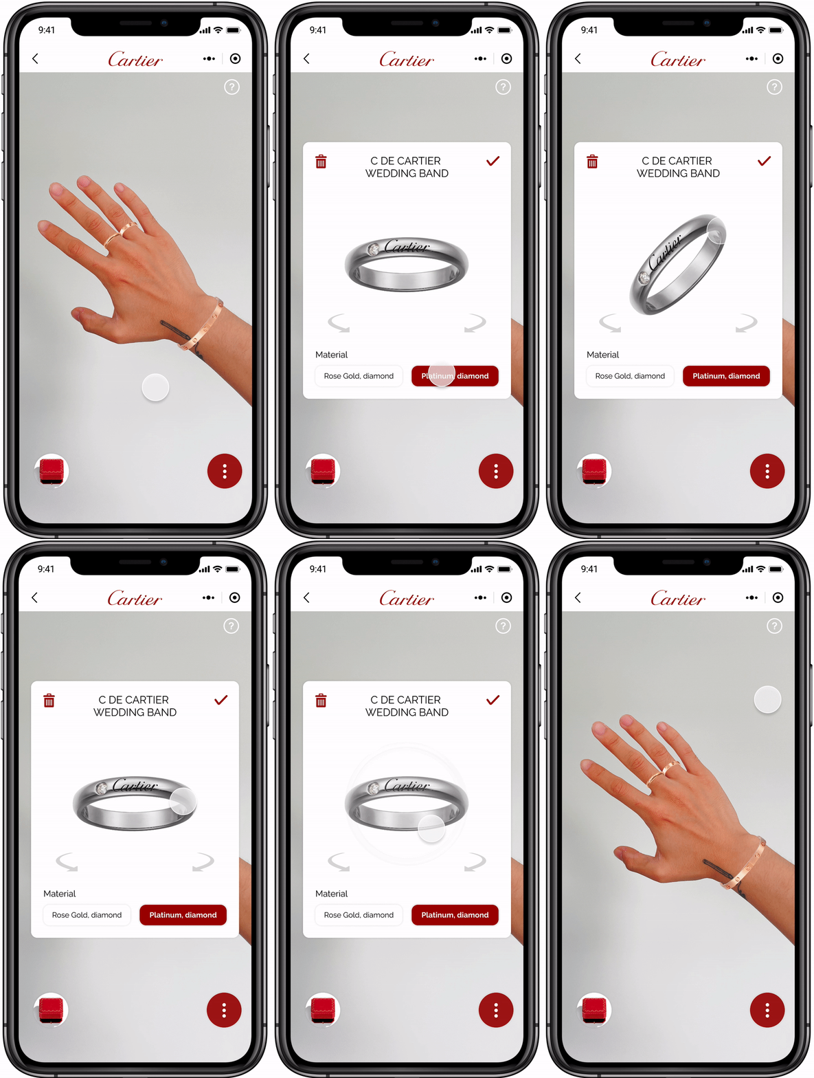
Product Details
The product-detail-display interface allows the user to be truly immersed in the real world of use. The user can also easily switch between materials and delete the worn ring.
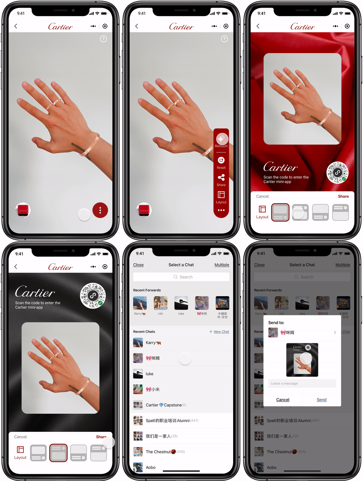
The Toolbar
This freely retractable toolbar is fixed in a uniform position on the screen. It is designed to allow the user to focus on the interface where the results of the hand fitting are presented and the Jewelry box.
Users can manually turn off retouching and reset all activities, as well as select the final photo layout and share it with friends on WeChat.
Introspective
It is essential to communicate with the client regularly to confirm their business goals and our design progress. Frequent communication helps to make timely changes in design and to maximize the fulfillment of our client's needs.
Feedback
The way we designed to move the ring from one finger to another has been adopted by Cartier and is now running this way on the Cartier WeChat app. Users can move the ring to preset positions by long-pressing on the product.
In the Future

Inactive (left) state and active (right) state of Jewelry Box.
The CTA button in the activated state of the jewelly box should be different from the inactive state. By simulating the open and closed state of the jewelry box in a real environment, we can relate the user to the real try-on experience in the shop.
