


Cartier
USABILITY TESTING
FOR WECHAT MINI-PROGRAM
The Cartier Mini program is a marketing and service program designed for potential customers who cannot access the Cartier boutique to purchase Cartier items. Our team conducts the usability testing with ten users, using this report as a guide to improving the user experience of the Cartier mini program.
Tools
Figma, Heuristic Evaluation Affinity
Mapping, Priority Visualization
Role
UX Designer
Researcher
Duration
1 Month
2021 May - Jun

THE PROCESS
INITIATE TEST PLAN
Identify Objectives
Defining the Scope
Create Test Script
Recruit Users
FACILITATE THE TEST
Observe Users
Identify Issues
Interview Users
ANALYSIS
Assess User Behavior
Analyze User Click Path
Assess UI Execution
CREATE TEST REPORT
Review Video Footage
Identify Design Issues
Categorization of Result
Provide Recommendations
MODIFICATION
Propose Amendments
Clarify Benefits
TESTING SCOPE
After communicating with the client, we narrowed our testing scope to two sections, Gift Advisor and Cartier Creations. We tested both sections with the aim of better understanding the user experience and improving the current version.

INITIATE TEST PLAN
We selected some participants, both familiar with and unfamiliar with Cartier, to complete three tasks guided by us. Our team members do face-to-face or remote interviews. And record interviewees’ click paths, length of time spent on the tasks, and their overall experience and reactions to using the Cartier mini-program.
Task 1 - 5 Seconds Test
When you enter the Cartier WeChat Mini program, What do you capture at first glance once entering the homepage?
Task 2.1 - First Click Test
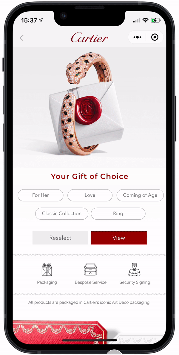
Where do you first click when you pick a gift for your friend?
Task 2.2 - Experience Test
( Gift Advisor )
After you pick a gift, finish the shopping process before you checkout.
Task 3 - Experience Test
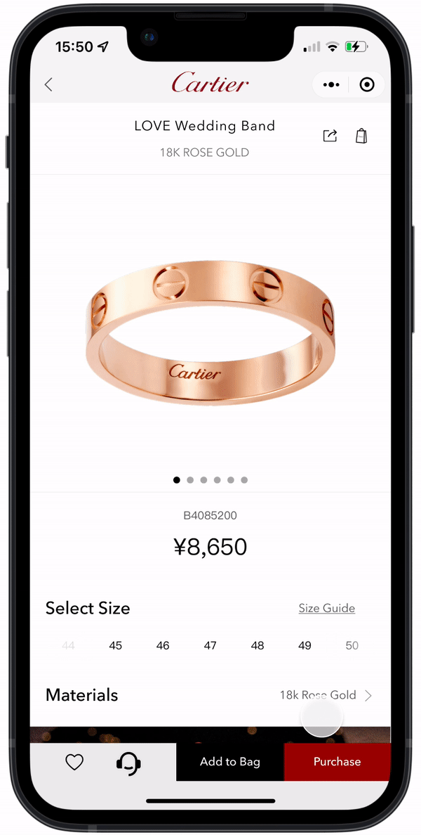
( Cartier Creations )
Please choose your favorite jewelry and add it to your shopping cart.

FACILITATE THE TEST
10 participants in total
Unfamiliar with Cartier products but familiar with online shopping: 7
Familiar with Cartier products, but may never purchase Cartier products online: 3
Age Range: 20-55
USABILITY TESTING DATA

HEURISTIC EVALUATION
Heuristic evaluation helps to identify usability problems in the user interface design. It involves, in particular, the evaluator examining the interface and judging whether it conforms to recognized principles of usability. I have selected several key points from the interview results and categorized them according to recognized usability principles to understand potential problems with the Cartier mini-program interface. Those potential problems are helpful for the following recommendations and amendments to the interface.

FINDINGS AND RECOMMENDATIONS
TASK 1 - 5 SECONDS TEST
What do you capture at first glance once entering the homepage?
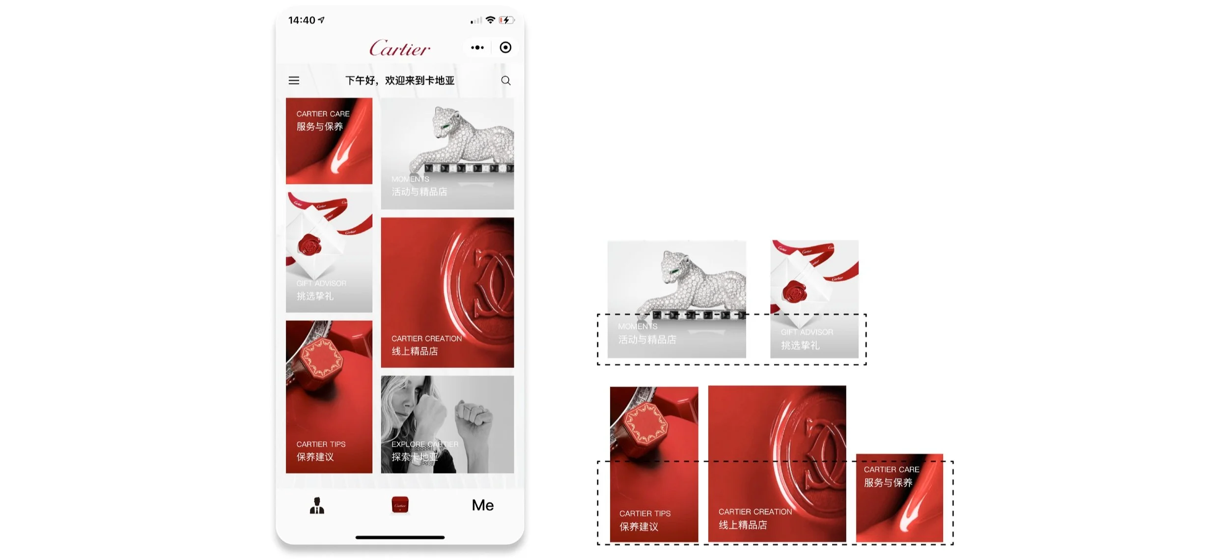
Fonts on the homepage
Findings
7 out of 10 neglecting to pay attention to the text.
8 out of 10 participants failed to capture Cartier Creation (Online shopping portal).
7 users only notice red blocks.
Homepage
Recommendations
Change font thickness and color according to the background image to improve accessibility.
TASK 2.1 - FIRST CLICK TEST
Where do you first click to buy a gift for your relative, love, or friend?
Findings
6 new customers click the Gift Advisor without hesitation. 3 existing customers make their selection in Cartier Creation.
TASK 2.2 - SHOPPING EXPERIENCE TEST ( GIFT ADVISOR )
After you pick a gift, please finish the shopping process before you checkout.

Recommendation
Make it easy and convenient for customers to return to the homepage.
Make the Back to Home button appear on the filtered items pages.
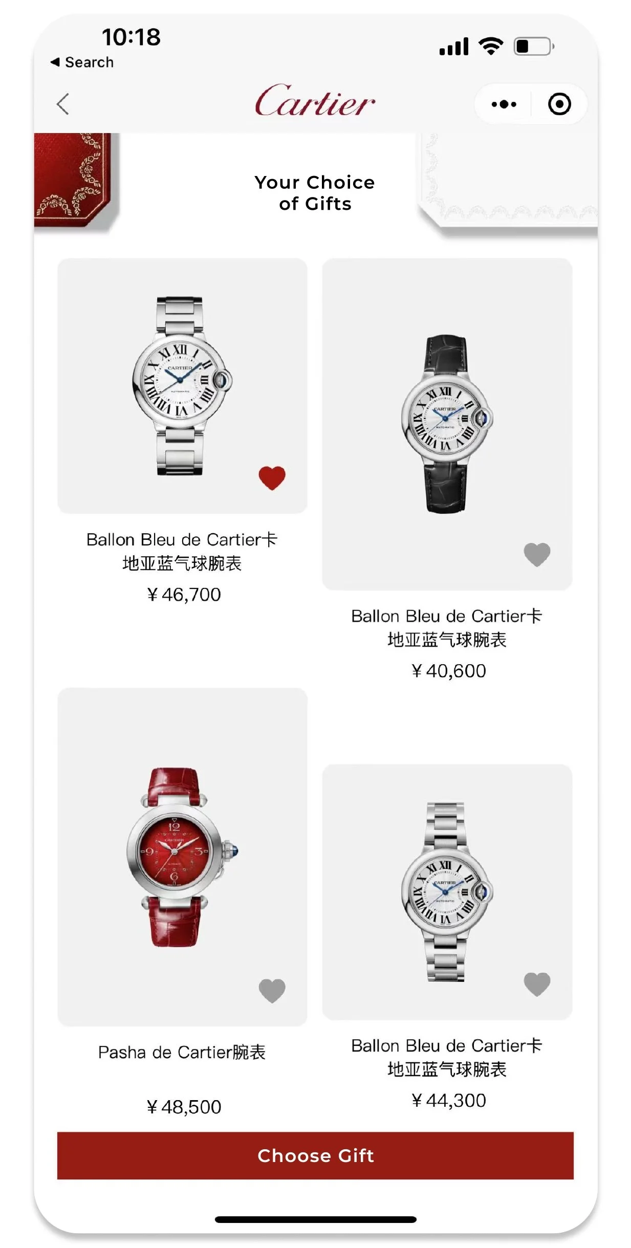
TASK 3 - SHOPPING EXPERIENCE TEST ( CARTIER CREATIONS )
Please choose your favorite jewelry and add it to your shopping cart.

Product Information Page
Shopping Cart
Positive Finding
Product-related info is displayed prominently.
Users like to view the collections list directly on the homepage of the online shopping portal.
Negative Finding
80% of users failed to find the finger instruction and don’t know the finger size unit shown here.
60% of find that they cannot confirm their chosen finger size and product material in the shopping cart.
Recommendation
Make it easy and convenient for customers to return to the homepage.
Make the Back to Home button appear on the filtered items pages.
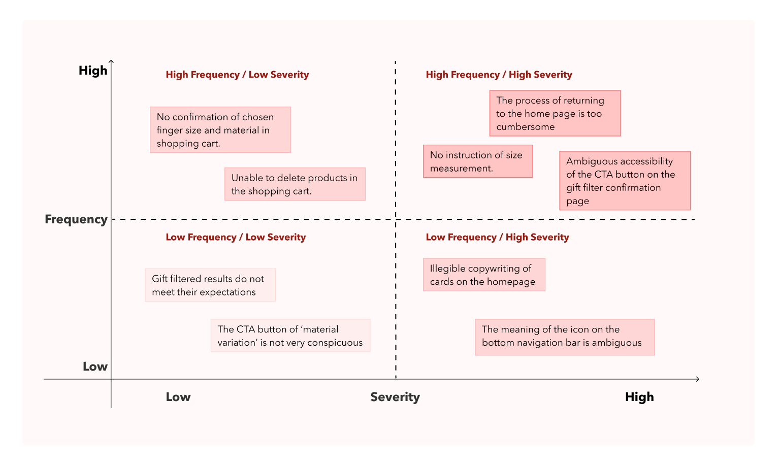
PRIORITY VISUALIZATION
After analyzing the data, I prioritize the issues based on the frequency of occurrence and severity of the problem to provide critical solutions upfront.
REDESIGN
Based on the priorities posted above, I communicated with the client and decided to visualize those recommendations and mainly redesign Cartier Homepage, Gift Advisor, Size Guide, and Shopping Bag.
HOMEPAGE
Enhancing readability
The white and transparent background is placed between the font and the background image to make the font stand out.

Before
After
BACK TO HOMEPAGE
Keep original home button
Now customers can go back to the homepage without clicking the eight times the back button.
Before
After
SIZE GUIDE
Shorten the journey for users to find information on product dimensions
Instead of scrolling down to the bottom of the page to find it, you can now quickly navigate to the size guide

Before
After
SHOPPING CART
Stay on the Page
Users can now view their ring size information in the shopping cart and can easily select another ring size.

Before

After
RETROSPECTIVE
When I conduct usability testing, it is interesting to note that sometimes users behave unexpectedly differently from what we think they would. Such differences are something I need to be aware of, which allows me to gain a deeper understanding of the product and an objective and clear view of the needs and behavior of users when they use the product.
In terms of the redesign, I developed several solutions based on usability testing results. Additionally, accessibility issues are addressed, including font size, font thickness, and contrast of colors.